META DESCRIPTION: The Ethereum Rainbow Chart can be a useful tool for analyzing ETH’s price movements – learn how it can help you inform your investment decisions.
The Ethereum Rainbow Chart is a graphical representation of ETH price movements that uses color bands to indicate whether ETH is overvalued or overvalued at any given time. The chart draws data from historical Ethereum price data, presenting it in a logarithmic fashion.
With Ethereum showing robust bullish activity over the past couple of weeks and the movements in the broader crypto market driven by renewed investor optimism, many investors and Ethereum holders are wondering how ETH might perform in the coming weeks and months.
In this article, we are going to explain what is the Ethereum Rainbow Chart and how it can be used as a complementary tool to make informed investment decisions.
What you'll learn 👉
What is the Ethereum Rainbow Chart?
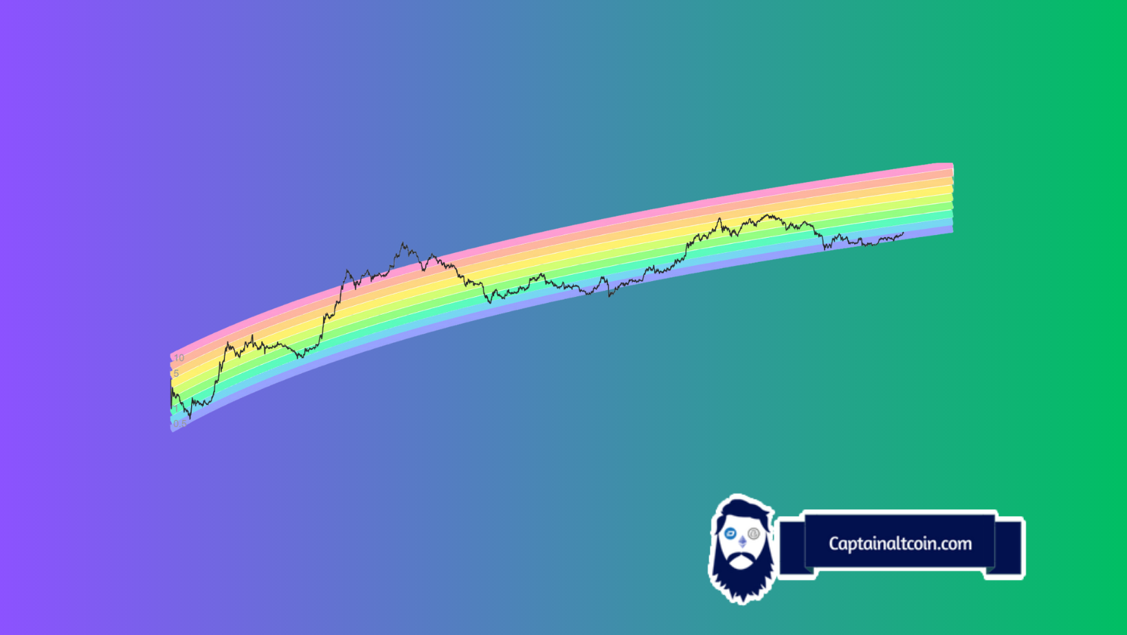
The Ethereum Rainbow Chart is a graphical representation of Ethereum’s past and potential future price trajectory, offering a streamlined view of the main resistance and support price levels. The chart is modeled using logarithmic regression and uses a color-coded spectrum to represent the different price zones.

The Ethereum Rainbow Chart allows you to easily analyze historical and future ETH price movements. Image source: CoinCodex
The colors in the Ethereum Rainbow Chart go from dark red to blue, like in a rainbow, hence the name. The red band is the most expensive, and the blue band is the cheapest. In total, there are nine distinct bands, each showing what a particular price level could mean in a historical context – if you see that Ethereum is trading in the dark red band, for instance, you can quickly deduce that ETH is heavily overbought and could see a big price correction going forward.
It is worth pointing out that the Ethereum Rainbow Chart shouldn’t be used as a foolproof prediction tool due to its limitations. It can’t take into account things like current events, software development, investment sentiment, or any other external data points that could have an impact on ETH price. Instead, it relies on historical price movement trends to model future price movements. For this reason, the Rainbow Chart works best as a complementary research tool and shouldn’t be used as an exclusive source of information.
How to use the Ethereum Rainbow Chart to predict ETH price?
The idea behind the chart is to help you make better decisions about when to buy or sell Ethereum. For example, if the price of ETH is in the red band, it means that it is very high compared to its historical trend, and it might be a good time to sell some of your ETH and take some profits.
On the other hand, if the price of Ethereum is in the blue band, it means that it is very low compared to its historical trend, and it might be a good time to buy some Ethereum and hold it for the long term.
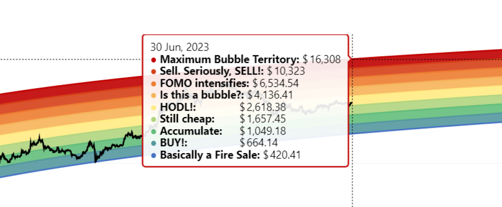
Each band on the chart features a self-explanatory description of different ETH price levels. Image source: CoinCodex
Here’s an example of how using the Ethereum Rainbow Chart can come in handy in a real-world setting. Let’s say you might be interested in knowing whether buying ETH at its current price might be worth it based on past price trends. With the price of ETH hovering around $1,850 at the time of writing, we can consult the chart to see how that price compares to historical movements.
In the image above, we can see that the current price of ETH positions it in the yellow band, which is right in the middle of the pack. This means that Ethereum markets are currently balanced, with no significant overselling or overbuying going on. However, if you are looking to hold ETH for a longer period of time – for example, till the end of the year – that same price of $1,850 would position ETH in the “Still cheap” band, signaling that it might be a good price level to enter the position.
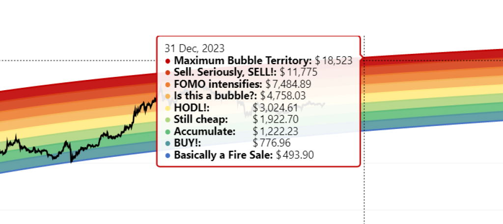
If ETH is trading in one of the higher bands, you should consider selling it and taking profit. Image source. CoinCodex
These findings can inform your investment decisions and allow you to plan your trades accordingly. As a basic rule of thumb, you should be more willing to sell your ETH when it is in the higher bands and hold onto it or even buy some more when it is in the lower bands.
Ethereum Rainbow Chart is a great analytical tool, but make sure to consider its limitations
The Ethereum Rainbow Chart draws data from nearly 8 years of Ethereum historical price data, providing an easy-to-understand view of ETH’s price movements and its support and resistance levels. Still, the Rainbow Chart relies on historical data exclusively, so it shouldn’t be used as a primary investment resource.
However, in combination with a prediction tool like CoinCodex’s Ethereum price prediction algorithm, which takes into account additional technical indicators and the cyclic nature of crypto bull and bear markets, the Rainbow Chart can be a very powerful tool.
Generally speaking, the price peaks and valleys you can find on the Ethereum Rainbow Chart are largely correlated with Bitcoin’s halving cycle. Usually, the cryptocurrency prices reach their peak about a year into each halving cycle and revisit it every four years. The next BTC halving, the fourth so far, is expected to happen in the spring of 2024. Check the video below to see which cryptocurrencies could be a good investment in light of the next halving event.


