Silver price is trading around $67 per ounce after another volatile stretch that has seen the precious metal recover substantially from its mid-year lows. Spot silver was around $67.11 early Thursday after gaining 3.3% during Wednesday’s session.
But while traders debate whether silver’s next move is toward $70 or back toward the low $60s, trader Axis is looking at a much larger picture.
The trader has returned to a long-term silver chart originally mapped out in June, arguing that the underlying thesis remains intact after price bounced from a major support area. At the center of his analysis is an enormous cup-and-handle formation spanning roughly 45 years.
Importantly, Axis isn’t presenting the enormous upside path drawn on his chart as a near-term price target. He explicitly calls it illustrative rather than a forecast and argues that a structure this large could take years to fully develop.
What you'll learn 👉
Axis Trader Says Silver Has Bounced From Long-Term Support
Axis’ chart uses the monthly silver futures timeframe and stretches all the way back to the famous 1980 silver pump.
The first major feature is the enormous rounded formation extending from the 1980 peak through decades of lower prices and eventually back toward the same region. This forms what the trader interprets as the “cup.”
Silver’s 2011 rally toward $50 forms another major peak on the right side of the structure. The long period that followed can then be interpreted as the “handle.”
The chart becomes particularly interesting after silver finally broke above the historical $50 region and eventually surged to a record above $120 earlier this year. Other long-term analyses have similarly identified the multi-decade break above $50 as a major technical event for the silver price.
That breakout was followed by an enormous correction, with silver eventually falling back into the $50–$60 region.
Axis’ chart marks this area as long-term support, and this is the bounce he is now referring to.
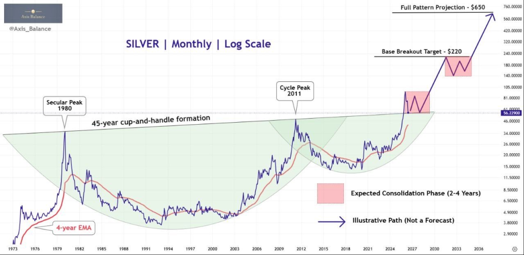
Silver has since recovered toward $67, meaning the market has so far defended the broader breakout area.
Why the 45-Year Cup-and-Handle Is Important
The bullish argument is that silver spent decades building a base underneath approximately $50.
After finally breaking through that ceiling, the old resistance area can potentially become long-term support.
This makes roughly $50–$55 one of the most important areas on Axis’ chart. As long as silver remains structurally above that region over the longer term, the massive breakout thesis remains alive.
The trader’s projected path shows silver spending considerable time building a new base before eventually accelerating higher.
That distinction matters.
This isn’t a prediction that silver will suddenly explode from $67 into triple digits. Axis specifically warns that secular formations can take years to develop, writing that investors should “build the base,” respect silver’s volatility and allow time to do the work.
Read also: Here’s Why Silver Price Could Return to $121 Despite the Recent Crash
How High Could Silver Go?
The most eye-catching part of the chart is naturally its upside projection.
Axis draws an illustrative long-term path that eventually takes silver through $100 and substantially beyond its 2026 record.
The trajectory then accelerates dramatically, ultimately reaching several hundred dollars per ounce in the 2030s.
But treating those levels as concrete price targets would misrepresent what the trader actually said.
He explicitly states that the path is illustrative, not a forecast. The useful part of the chart is therefore less about predicting whether the silver price will trade at $200, $300 or $500 on a particular date and more about the underlying structure.
For the bullish thesis to remain credible, silver first needs to establish that its multi-decade breakout can hold.
That makes the current $60–$70 region much more relevant today than the huge numbers drawn near the top of the chart.
What Could Invalidate the Silver Thesis?
The biggest risk is that silver’s breakout above its historical highs eventually proves unsustainable.
The metal already demonstrated how violent its corrections can be when it fell from above $120 earlier this year into the high-$50s by July.
That makes the broader $50–$60 region critical.
If silver continues building above this area and eventually begins making higher long-term highs again, Axis’ macro structure would remain compelling from a technical perspective.
A sustained breakdown beneath the former multi-decade breakout zone, however, would weaken the cup-and-handle interpretation considerably.
In the shorter term, silver still has hurdles much closer to today’s price. Another recent technical assessment places $65–$65.20 as an important near-term area, with silver needing to continue holding above it to maintain the current recovery.
Axis’ viral chart therefore shouldn’t be read as a promise of several-hundred-dollar silver.
The more interesting message is what has already happened: after spending decades struggling with the $50 region, silver finally broke through it, suffered a huge correction and has so far bounced from the broader long-term support area.
Subscribe to our YouTube channel for daily crypto updates, market insights, and expert analysis.