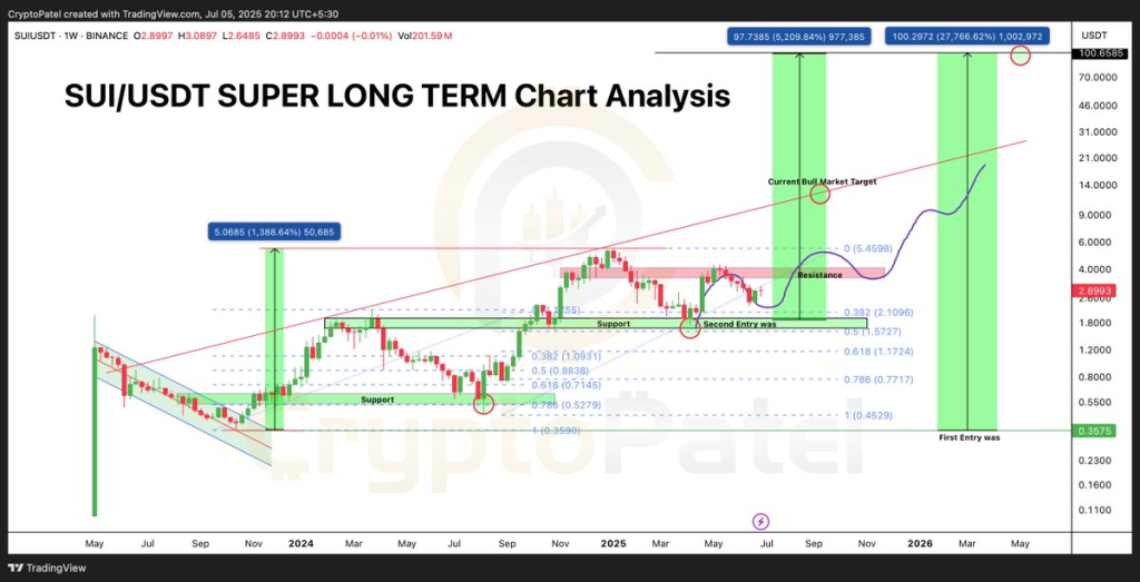
Crypto Patel just dropped a massive long-term chart for SUI, and it’s turning heads – not just because of how clean it looks, but because of what it suggests: a path from $0.35 to $100.
Yes, that sounds wild. But let’s walk through it.
The weekly chart shows a clear breakout structure forming. After bottoming out around $0.35 in late 2023, SUI has been building a strong base, bouncing off support zones and slowly reclaiming key levels. These aren’t random price movements – they follow a textbook trend reversal pattern.
The SUI chart highlights two major entry points: the first around $0.35 (the absolute bottom), and a second near the $1.50–$1.70 zone, right at the 0.618 Fibonacci level. This retracement level often acts as the launchpad in bull markets – the zone where smart money accumulates before a big leg up.
Currently, SUI is trading around $2.89 and sitting just under a resistance zone it has tested multiple times. A breakout from here would flip that resistance into support and open the door to much higher price targets.
What you'll learn 👉
The Road to $14 – and Then Much More
The chart maps out two massive green zones that represent potential bull market phases. If SUI can maintain its structure and break out of this current range, the first major target sits around $14. That alone would be a huge gain from current levels.
But Patel’s chart doesn’t stop there.
The second target, marked as the “Current Bull Market Target,” shows the SUI price climbing toward the $97–$100 range over the next 12–18 months. That’s a potential 5,000% to 27,000% increase from early accumulation zones – and even more for those who got in at $0.35.
That may sound like hopium, but it’s not without precedent. Crypto has seen coins go 100x before, especially when the fundamentals, timing, and hype align. SUI has been quietly building its ecosystem, and it’s part of the broader narrative of modular chains and next-gen scalability.
Read also: Will a $10,000 XRP Break the Ledger It Was Built On? Some Say Yes, Others Disagree
Why the Chart Matters
This chart is more than just lines and arrows. It reflects how patient accumulation, Fibonacci retracements, and long-term trendlines can all combine to tell a story. And right now, that story for SUI looks very bullish.
Importantly, the chart doesn’t promise a moonshot overnight. It outlines a longer-term trajectory – something that might play out in waves through 2025 and into 2026. It shows a stair-step pattern of resistance flipping to support, consolidations, and expansions – all of which are healthy in sustained bull runs.
Final Thoughts
If you’re holding SUI or thinking about entering, this chart is worth studying. While nothing is guaranteed in crypto, it gives a visual blueprint of what could happen if market conditions continue improving and the project delivers on its vision.
And if that path to $100 actually plays out?
Then the people who were buying at $0.35 – or even now, near $3 – might one day look back and realize they were early.
So is $100 for SUI a dream? Maybe. But as this chart shows, it’s not an impossible one.
Subscribe to our YouTube channel for daily crypto updates, market insights, and expert analysis.