Gold and Gold Stocks Just Crashed 20%, But These 8 Charts Say the Real Move Hasn’t Even Started

Veteran gold and gold stocks investor Jordan Roy-Byrne shared a detailed multi-chart breakdown examining whether the recent ~20% collapse in gold marks the end of the correction—or the beginning of a longer consolidation phase. His framework relies heavily on historical breakout analogs, relative strength ratios, and breadth indicators.
Below is a structured look at the eight charts he showed and what they collectively indicate about gold’s next major move.
What you'll learn 👉
1) Gold Correction Analog: 1972, 2005, and 2024 Compared
Roy-Byrne compares three major structural breakouts: 1972, 2005, and the 2024 breakout from a 13-year base. The first chart overlays post-breakout corrections from 1973 (blue), 2006 (green), and 2026 (black), alongside an average path.
In both prior cases, gold didn’t just dip—it experienced multi-month pullbacks of roughly 24%–28%. The 1973 correction unfolded in a stair-step decline over about five months before the next advance began. The 2006 correction was choppier but similarly time-consuming.
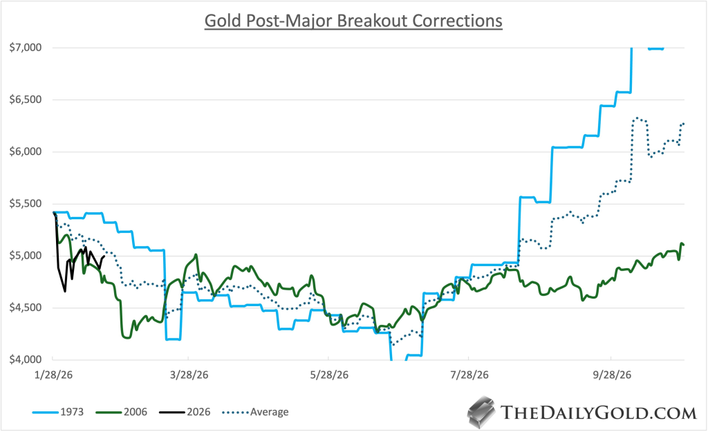
In 2026, gold dropped approximately 21% from its peak—but did so in a compressed, high-velocity move. The chart visually shows how much faster the current decline was relative to prior cycles. The missing element is time: prior breakouts corrected both in magnitude and duration. If history rhymes, gold may need to move sideways or grind modestly lower for several more months to fully reset sentiment and positioning.
2) Gold and the 200-Day Moving Average
The long-term weekly chart highlights a critical feature: gold has not tested its 200-day moving average since November 2023. That is historically rare.
In the early 1970s breakout, gold went an extended period without touching the 200-day, but eventually mean reversion did occur before the trend resumed. On the current chart, the 200-day (rising steadily) sits well below price and continues to climb.
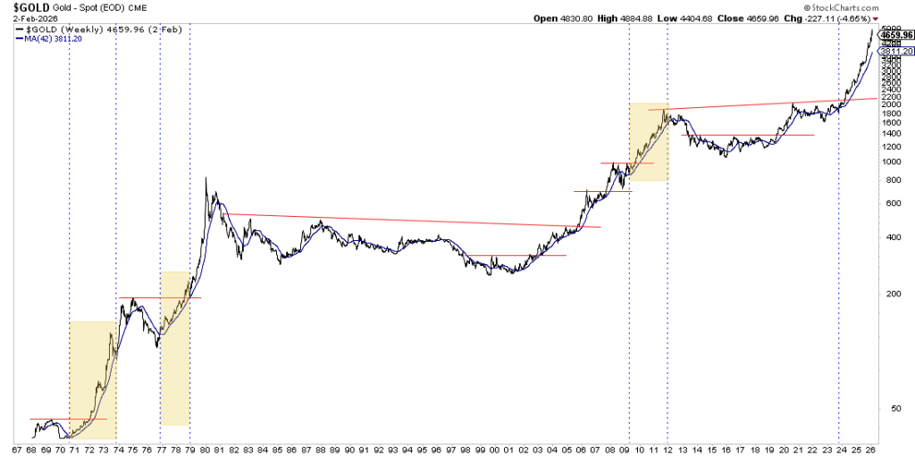
If gold consolidates into late spring, the moving average could rise toward the $4,300–$4,400 region, converging with potential horizontal support. A test of that level would align with historical analogs and would not violate the larger breakout structure. The alternative scenario—no test until late 2026 or early 2027—would imply extraordinary underlying strength, similar to early-1970s momentum phases.
3) Major Breakout Analog and the $6,900 Target
The “Gold Major Breakouts Analog” chart compares the 1972 breakout (blue), the 2024 breakout (brown), and an average trajectory derived from historical analogs.
The 1972 breakout saw gold surge toward $6,000 (inflation-adjusted equivalent in the analog), correct nearly 28%, then resume higher toward $9,200. The current 2024 breakout path closely tracks that early structure, though slightly lagging.
If gold retraces toward ~$4,300 and later reclaims the January high near ~$5,600, a measured move projects toward roughly $6,900. The chart visually demonstrates how the average path (1972 + 2005 composite) trends toward nearly $7,000 within roughly 13 months of breakout.
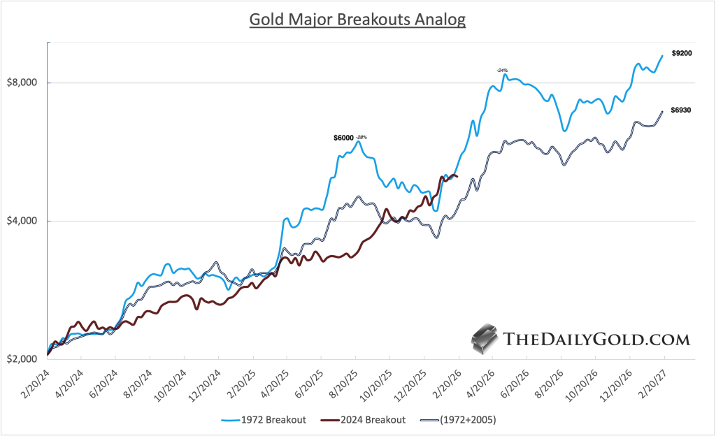
Roy-Byrne acknowledges that 13 months may be aggressive, but even a 15–18 month timeline would still keep the structural bull thesis intact. The key takeaway from the visual alignment is that the current move has not deviated materially from past secular breakout behavior.
4) Gold vs. the S&P 500
The Gold-to-S&P ratio chart shows a decisive breakout from a 12-year base. That base capped gold’s relative performance since roughly 2012.
The ratio exploded to 0.78 before pulling back sharply during the recent metals crash. Importantly, it retested the breakout zone near 0.65–0.68 and held. The dashed support line highlights this former resistance-now-support area.
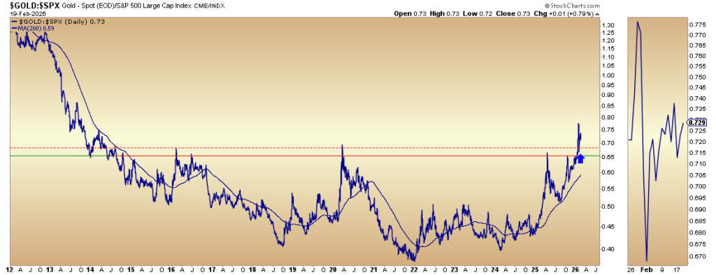
Breakouts from decade-long bases are rarely trivial. When successfully retested, they often mark the start of prolonged relative outperformance. If the ratio holds above 0.65, it implies capital allocation is beginning to favor gold over large-cap U.S. equities—a potential leadership shift.
5) Gold vs. the Technology Sector
Two ratio charts—Gold vs. Nasdaq and Gold vs. Nasdaq 100—show gold pressing against or breaking above multi-year resistance.
Gold recently closed at a 9-year high relative to the Nasdaq. On the weekly ratio chart, price is attempting to break above a long downward sloping resistance line dating back to the mid-2010s.
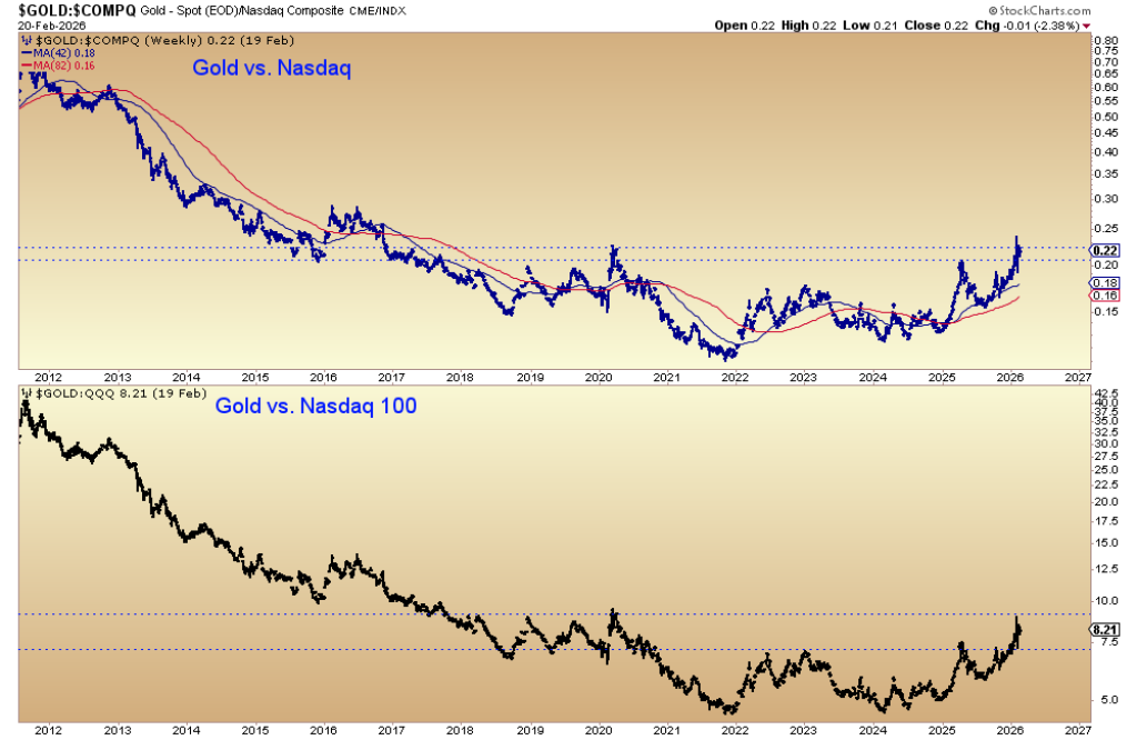
Against the Nasdaq 100, gold has already broken out from a 5-year base and is now testing an even longer 8-year structure. If sustained, this move signals that gold is not just outperforming broad equities—but specifically the technology sector that has dominated global leadership for over a decade.
Such relative shifts historically coincide with macro regime changes.
6) Gold Stocks vs. the S&P 500
The GDX-to-S&P ratio chart shows gold miners breaking out from a 12-year base in late January.
The violent pullback drove the ratio from 0.0160 down to roughly 0.0135, but it held prior resistance-turned-support between 0.0125 and 0.0130. The chart visually marks these levels with horizontal lines and arrows, emphasizing how prior rejection zones are now acting as structural support.
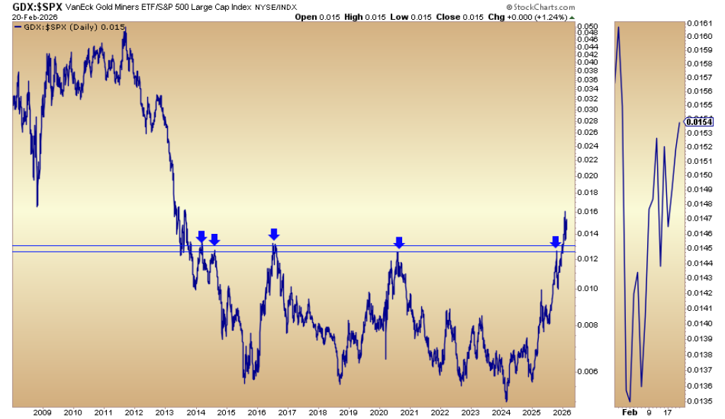
The successful retest indicates institutional capital did not abandon the breakout. Historically, miners tend to lead in sustained precious metals bull markets. A stable or rising ratio reinforces the thesis that gold equities may outperform the broader market in coming quarters.
7) Gold Stocks vs. the Nasdaq
The GDX vs. Nasdaq and GDX vs. Nasdaq 100 charts display similar long-term basing structures.
Miners have broken out from a 9-year base against the Nasdaq, with the breakout currently holding above horizontal support levels. The next challenge is longer-term resistance from roughly 12-year highs.
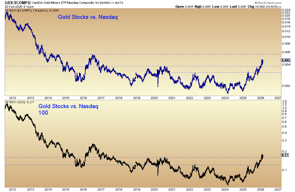
Against the Nasdaq 100, the breakout from an 8.5-year base appears cleaner and more advanced. If miners continue holding above breakout zones while tech consolidates, it strengthens the case for a broader capital rotation away from growth-heavy sectors toward hard asset exposure.
8) GDX Advance/Decline Line
The GDX advance/decline (A/D) line chart shows cumulative participation within the gold mining sector.
Notably, the A/D line made higher highs before GDX itself—highlighted by boxed regions on the chart. That positive divergence often acts as a leading indicator, signaling broad participation beneath the surface even when price hesitates.
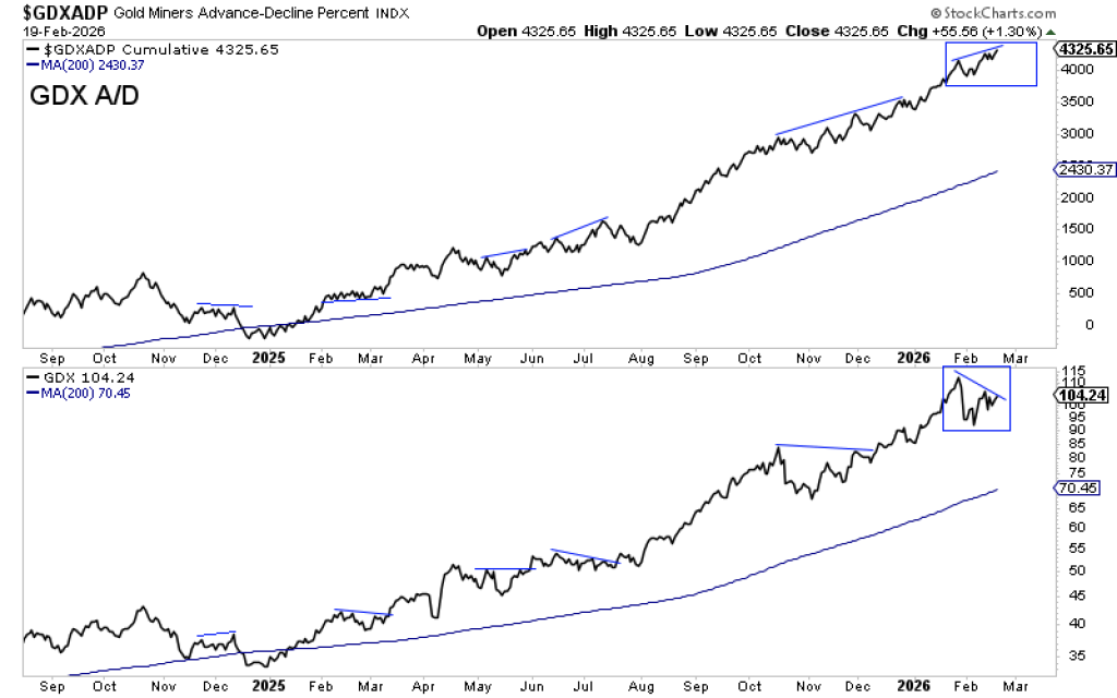
Currently, the A/D line remains elevated and constructive, which indicates internal strength persists despite the recent price volatility. In strong bull markets, breadth typically expands before price accelerates again. That pattern appears to be repeating.
Summary: Price Did the Work – Time May Still Be Ahead
Roy-Byrne’s core thesis is that gold likely needed roughly a 20% correction in 2026 as part of a larger move potentially targeting ~$6,900 into 2027.
The unusual element this time is speed. Instead of a drawn-out 5-month grind lower like in 1973 or 2006, gold delivered most of the downside in just days.
That leaves one central question: will gold now move sideways for several months to satisfy the historical time component?
Structurally, gold remains strong:
- The breakout versus the S&P 500 is holding.
- Relative strength versus tech is improving.
- Gold stocks are maintaining their breakout versus equities.
- Breadth indicators are leading positively.
Early signs of capital rotation away from tech and toward precious metals are emerging. If that shift continues, it could provide the fuel for the next major leg higher.
For now, the correction may not be about how deep, but how long.
Read also: Gold Price Prediction: Wall Street Remains Underweight at Record Highs
Subscribe to our YouTube channel for daily crypto updates, market insights, and expert analysis.