Veteran chartist Peter Brandt doesn’t spend much time debating narratives. His latest comment on silver was blunt: silver is something to own, not something to argue about. Price comes first. Everything else is noise.
Brandt’s view is rooted in how he works. He treats markets as a set of possible paths, not certainties. Charts act as his starting point. From there, price either confirms the idea or invalidates it. In silver’s case, the long-term structure has his attention.
What you'll learn 👉
What Brandt Actually Said
Brandt framed silver through a Bayesian lens. That sounds complex, but the takeaway is simple. He sees two broad outcomes at any moment, and price decides which one survives. He does not anchor to stories about manipulation, inflation, or shortages. He anchors to what the chart is doing over decades.
His conclusion surprised many. The long-term chart, in his view, allows for $600 silver. Not tomorrow. Not in a straight line. Just as a possible destination over time if the structure continues to resolve higher. Before that, he points to something far more realistic and immediate: $60 silver.
That distinction matters. Brandt is not calling for a vertical move. He is outlining a roadmap with pauses, corrections, and failed attempts along the way.
Breaking Down the Silver Chart He Shared
The chart is a monthly silver chart stretching back to the 1970s. That time frame matters. It filters out emotion and focuses on structure.
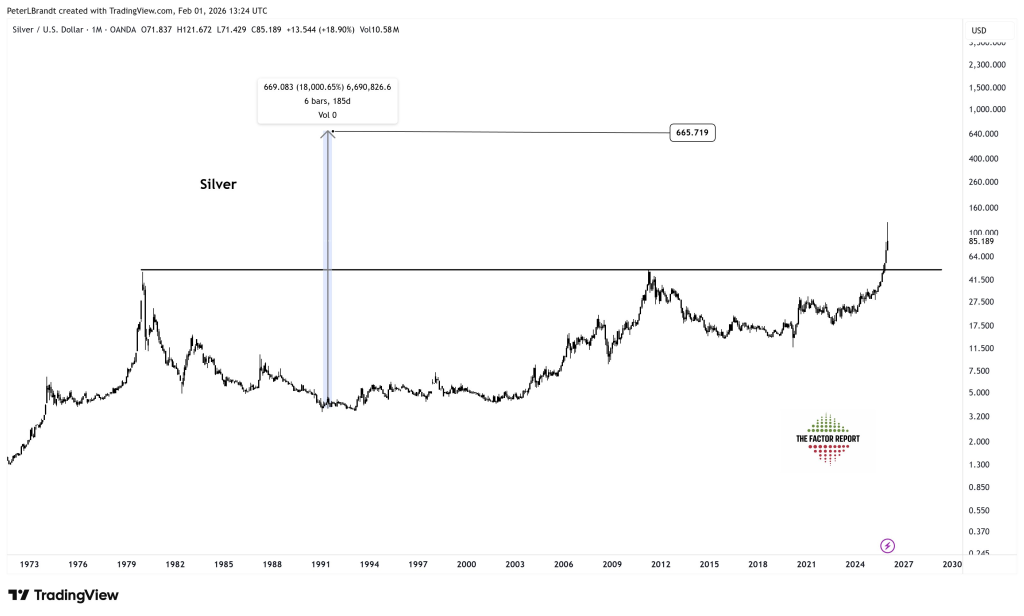
The most important feature is the horizontal resistance zone near the old highs from 1980 and 2011. Silver spent decades failing below that area. Every major bull run stalled there. That ceiling acted as a long-term barrier.
What has changed now is location. Price has pushed back into that zone with strength. The recent move cleared levels that capped silver for years, putting it back into a region where historical memory matters.
Brandt highlights a prior analog from the late 1970s. Back then, silver based for years, broke out, pulled back, and then exploded higher in a relatively short window. The vertical projection on the chart is not a forecast of speed. It’s a measured possibility if the breakout structure completes.
Why $600 Is Even on the Table
The $600 number comes from scale. On a logarithmic view, the distance between silver’s multi-decade base and its historical spikes is enormous. When assets spend a very long time compressing, breakouts can overshoot expectations.
That does not mean silver goes from $80 to $600 without interruption. Brandt is clear about that. Markets move in waves. Sharp advances are followed by brutal pullbacks. The chart allows for a path where silver first pushes toward $60, digests that move, and only later attempts something much larger.
Read also: Gold and Silver Slump Wipes Out Over $6 Trillion: What Forced This Massive Liquidation?
Trusting Silver Price Over Stories
One line from Brandt stands out: “I trust price, not narratives.” That sums up his entire stance.
Silver has no shortage of stories. Inflation hedges. Industrial demand. Monetary breakdown. Supply shortages. Those arguments come and go every cycle. Brandt avoids them entirely. If silver cannot hold above former resistance, the bullish case weakens. If it does, higher prices remain valid.
This keeps the analysis clean. No emotional attachment. No need to convince anyone. Price either confirms the breakout or proves it wrong.
Subscribe to our YouTube channel for daily crypto updates, market insights, and expert analysis.